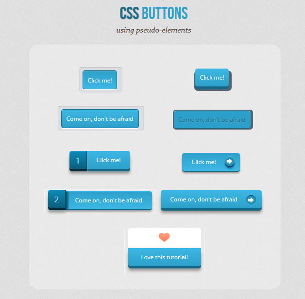
.a_demo_one {
background-color:#3bb3e0;
padding:10px;
position:relative;
font-family: 'Open Sans', sans-serif;
font-size:12px;
text-decoration:none;
color:#fff;
border: solid 1px #186f8f;
background-image: linear-gradient(bottom, rgb(44,160,202) 0%, rgb(62,184,229) 100%);
background-image: -o-linear-gradient(bottom, rgb(44,160,202) 0%, rgb(62,184,229) 100%);
background-image: -moz-linear-gradient(bottom, rgb(44,160,202) 0%, rgb(62,184,229) 100%);
background-image: -webkit-linear-gradient(bottom, rgb(44,160,202) 0%, rgb(62,184,229) 100%);
background-image: -ms-linear-gradient(bottom, rgb(44,160,202) 0%, rgb(62,184,229) 100%);
background-image: -webkit-gradient(
linear,
left bottom,
left top,
color-stop(0, rgb(44,160,202)),
color-stop(1, rgb(62,184,229))
);
-webkit-box-shadow: inset 0px 1px 0px #7fd2f1, 0px 1px 0px #fff;
-moz-box-shadow: inset 0px 1px 0px #7fd2f1, 0px 1px 0px #fff;
box-shadow: inset 0px 1px 0px #7fd2f1, 0px 1px 0px #fff;
-webkit-border-radius: 5px;
-moz-border-radius: 5px;
-o-border-radius: 5px;
border-radius: 5px;
}
.a_demo_one::before {
background-color:#ccd0d5;
content:"";
display:block;
position:absolute;
width:100%;
height:100%;
padding:8px;
left:-8px;
top:-8px;
z-index:-1;
-webkit-border-radius: 5px;
-moz-border-radius: 5px;
-o-border-radius: 5px;
border-radius: 5px;
-webkit-box-shadow: inset 0px 1px 1px #909193, 0px 1px 0px #fff;
-moz-box-shadow: inset 0px 1px 1px #909193, 0px 1px 0px #fff;
-o-box-shadow: inset 0px 1px 1px #909193, 0px 1px 0px #fff;
box-shadow: inset 0px 1px 1px #909193, 0px 1px 0px #fff;
}
.a_demo_one:active {
padding-bottom:9px;
padding-left:10px;
padding-right:10px;
padding-top:11px;
top:1px;
background-image: linear-gradient(bottom, rgb(62,184,229) 0%, rgb(44,160,202) 100%);
background-image: -o-linear-gradient(bottom, rgb(62,184,229) 0%, rgb(44,160,202) 100%);
background-image: -moz-linear-gradient(bottom, rgb(62,184,229) 0%, rgb(44,160,202) 100%);
background-image: -webkit-linear-gradient(bottom, rgb(62,184,229) 0%, rgb(44,160,202) 100%);
background-image: -ms-linear-gradient(bottom, rgb(62,184,229) 0%, rgb(44,160,202) 100%);
background-image: -webkit-gradient(
linear,
left bottom,
left top,
color-stop(0, rgb(62,184,229)),
color-stop(1, rgb(44,160,202))
);
}


